


You should spend about 20 minutes on this task.
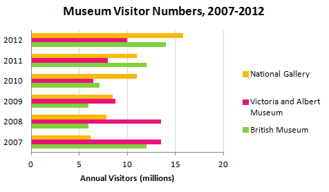
The bar chart shows the number of visitors to three London Museums between 2007 and 2012.
Summarize the information by selecting and reporting the main features, and make comparisons where relevant.
Write at least 150 words.
The graph below illustrates the three London Museums’ guests amount during five years from 2007 to 2012.
Overall, the highest point of the graph, that shows the number of people who went to the most visited museum in every year, fluctuated, rising in general from nearly 14 to 16 million. At the same time, we can see how the visitors’ preferences changed throw the period.
First of all, we can notice that the visiting preferences among the museums changed on the National Gallery’s favor at that period, so, the outstanding three times rise of this culture place visiting is markable. In 2007 the National Gallery attendance was outnumbered the two others by a significant margin, but it was considerably growing up during next five years.
With regards to Victoria and Albert Museum, it’s fullness double decreased during three years, dropping noticeably from 14 million in 2007 to 7 million in 2010; however, it started to grow up constantly from 2010 to 2012.
Meanwhile, being halved from 2007 to 2008, the number of the British Museum’s visitors started consistent rising for next three years from 2009 till 2012.


Комментариев нет:
Отправить комментарий